
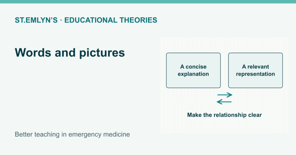
Cognitive theory and teaching design
Dual coding: what is the picture doing?
A picture can explain something that is difficult to put into words. It can also leave an audience wondering why it is there.
Original article: Nick Smith · 2019-03-21
Updated 21 October 2026 · 5 min read
Think about a slide with a photograph of a beer glass. It would make a reasonable introduction to a talk about alcohol. Keep the same picture on screen while explaining a metabolic pathway, though, and the audience still has to work out the pathway from your words. The glass isn’t doing much to help them.
Nick Smith used that example in the original article, and it gets us quickly to the point. What do we want the picture to explain? A diagram could show the relationships we’re talking about. A photograph might show an appearance we want someone to recognise. Either can help, provided we’ve chosen it for the job.
The move away from slides covered in text has much to recommend it. Ross Fisher’s P Cubed work, acknowledged in Nick’s original post, has encouraged many of us to think harder about presentations. Replacing every paragraph with an intriguing photograph can still leave the audience with quite a puzzle.
Why combine words and pictures?
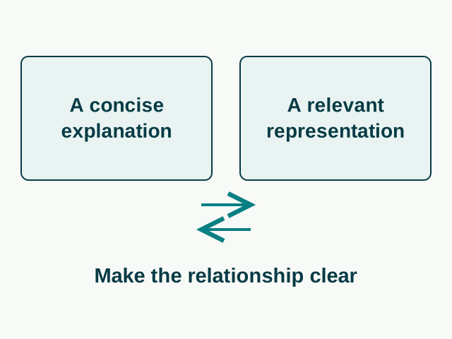
Dual coding theory, associated with Allan Paivio, describes verbal and nonverbal representations and the connections between them. Clark and Paivio’s account offers a way to think about how an idea might be represented and recalled through more than one route.
For teaching design, we also draw on the cognitive theory of multimedia learning. Mayer and Moreno describe the work involved in selecting information, organising it and connecting words with pictures. That processing has limits. Adding more material can make an explanation harder to follow.
It’s easy to lump these ideas together, as the earlier version of this article did. The distinction is worth keeping. Dual coding concerns representations; multimedia learning helps us think about the design of explanations using words and pictures. Both connect with working-memory models and cognitive load theory.
And verbal versus nonverbal doesn’t simply mean ears versus eyes. You can read words. A diagram of separate channels is a model to help us think, rather than a literal wiring diagram of the brain. None of this promises that a picture will double recall, or requires us to divide the audience into visual and auditory learners.
Let the diagram do some explaining
Suppose you’re teaching someone how a piece of equipment works. You could show the whole device and point out the parts as you speak. If the relationship between those parts matters, a simplified diagram may make it easier to see. If movement matters, a short demonstration may be better.
Keep the labels near the things they describe. Make it clear where the explanation begins and which direction a sequence runs. If colour identifies a particular component, use it consistently and name the component too. A learner shouldn’t have to keep searching for a key while trying to follow what you’re saying.
There’s a judgement to make about detail. An experienced audience may understand a diagram that a new student finds bewildering. You might need to introduce the parts before showing how they interact, or build up a sequence over several views. Check the arrows carefully: they can imply causation or a compulsory order even when you only meant to suggest an association.
Then look at it on the device your readers will use. Reducing the font until everything fits on one page may satisfy the person making the page. It rarely helps the person trying to read it on a phone.
Do we have to get rid of the text?
A complicated animation, a paragraph to read and a presenter talking can leave the audience unsure where to look. Cutting the paragraph may help. But “never use text with narration” takes that advice too far.
Moreno and Mayer’s experiments on verbal redundancy found that the effect of adding text depended on the other visual material being shown. Concise labels and unfamiliar terms may deserve their place on screen. What becomes distracting in one presentation may help in another.
Captions, transcripts and descriptions also make the material available to people who can’t hear the narration or see the image. Keep those available. When a talk becomes a webpage, readers need enough explanation to understand it without the speaker standing beside them. A slide that worked beautifully in the lecture theatre may need substantial rewriting.
Get someone else to draw it
Ask a learner to sketch what you’ve just discussed and explain their drawing. You may discover that an arrow you thought was obvious meant something quite different to them. Now you’ve got something specific to talk about. Artistic ability isn’t the issue; a few boxes and lines can show plenty about someone’s understanding.
There is evidence for a memory benefit from drawing. Wammes and colleagues found that participants recalled words they had drawn better than words they had written. The experiments concerned word recall, so we shouldn’t claim they establish better clinical reasoning. In a teaching session, the attraction is also that you can discuss the learner’s explanation and correct it.
Ask them to describe the relationship in words as well, or use a written explanation if drawing doesn’t suit the task or the learner. Later, try a different example and see whether the explanation still holds.
Before adding another image to a teaching session, show it to someone who doesn’t already know what you mean. Ask them to talk you through it. If they spend the conversation trying to guess why you chose the picture, you’ll have found something to change before the audience arrives.
Originally published by Nick Smith on 21 March 2019. His acknowledgements to Ross Fisher, Oli Caviglioli (@OliCav) for help with the finer points of dual coding, and @allibobs83 for help with spelling, grammar and punctuation are retained.
References and further reading
- Clark and Paivio (1991). Dual coding theory and education.
- Mayer and Moreno (2003). Nine ways to reduce cognitive load in multimedia learning.
- Moreno and Mayer (2002). Verbal redundancy in multimedia learning: when reading helps listening.
- Wammes, Meade and Fernandes (2016). The drawing effect: evidence for reliable and robust memory benefits in free recall.
Keep exploring
Cognitive load theory · Spacing and retrieval · Back to educational theories

Pingback: #TTCNYC: Educational theories you need to know (about). St.Emlyn's • St Emlyn's
Pingback: Podcast Round Up March 2019. St Emlyn's • St Emlyn's
Hi Nick Smith – I just wanted to record my appreciation for this blog post. It is well written, making it accessible to most . It is direct, well applied and very easy on the ear and inner voice! Really valuable, easy read. I work for an Ed Tech company that is developing and designing learning materials for teachers and lecturers so that they can produce effective teaching and learning materials in a range of remote asynchronous contexts.
Well done and hugely appreciated.
Thanks Dan
Pingback: Module 3 – Learning Strategies